Design
Memory-friendly color design and color swatches
As we age, the visual acuity of many people declines. Seeing in low light becomes more difficult, colors fade, and blind spots may appear in the field of vision. When the changes caused by aging combine with the changes brought on by memory illness, such as the weakening of cognitive skills, the environment plays a large role in a person's ability to cope independently.
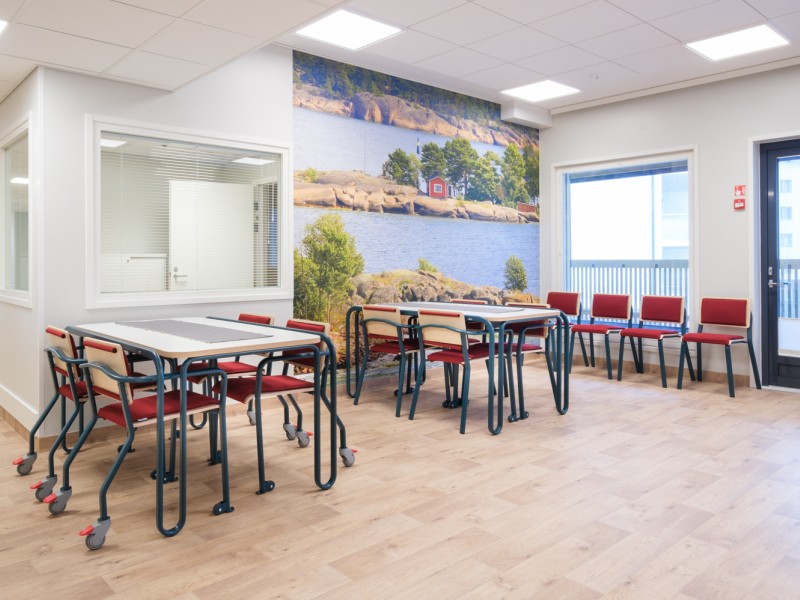
Colors, and especially darkness contrasts, help a person with memory illness perceive the space and the furniture within it. Color and light are used to create an atmosphere of warmth and safety in the space. Color and light are, therefore, an inseparable pair. The color of the light affects how we perceive color. The perception of color is always also influenced by the other colors it appears with, meaning "a color is only a color when placed next to another color."
A person with memory illness perceives furniture better when it stands out in darkness contrast from the colors of the floor and walls. The perception of a furniture item is made easier when its different parts are of different colors and sufficiently different in shade. For example, the perception of an armchair is helped when a different colored upholstery is chosen for the seat cushion than for the frame and backrest.
The sense of touch has a particularly great significance for a person whose sight has weakened. The sense of touch is one of the senses that is best preserved even as memory illness progresses. The touch of a pleasant material is calming and generates feelings of pleasure.
All fabrics selected for the color swatches are fire-safe, water-washable, and have high abrasion resistance values. The fabrics chosen for the swatches include coarser structured fabrics, smooth dense-surfaced fabrics, and velvety soft chenille fabrics.
Interior designer and accessibility surveyor (ESKEH) Tuija Salmi has compiled three color swatches inspired by the Finnish nature, which aid in the selection of furniture materials and colors.
The space in colors
Colors create atmosphere in a space.
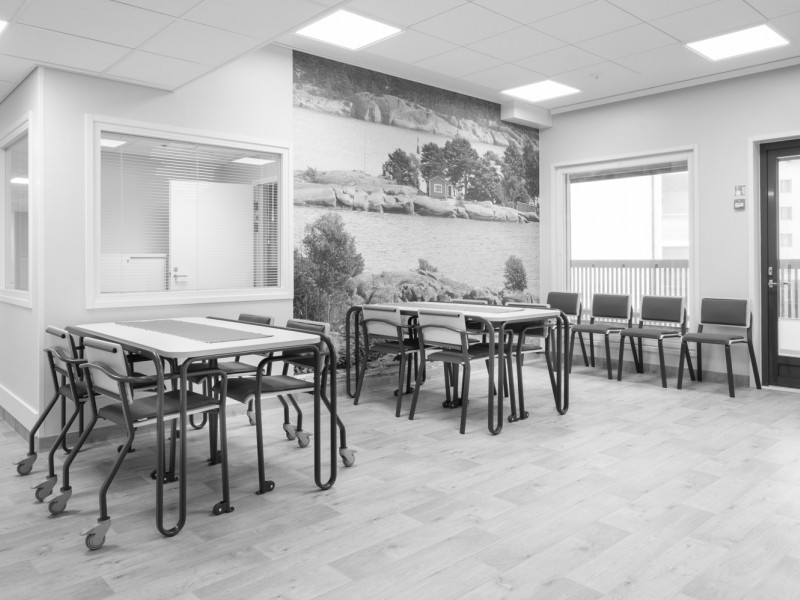
The same space in black and white.
Contrasts help in perceiving furniture.

Berry basket
Different shades of red playfully mingle in the berry basket. A few green twigs have also fallen into the basket.
A person with memory illness retains the ability to see shades of red for the longest time. Red as a color is encouraging to action. The reds in the berry basket are slightly subdued, which gives the red color a bit of softness and delicacy.
Upholstery fabrics
Incas 9404 red
Incas 9420 red/gray
Alba 4027 red
Alba 4007 wine red
Alba 7029 green
Patterned upholstery fabric
Tulip 8 red
Metal colors
RAL6013 reed green
RAL6019 sap green
RAL9016 white
RAL9005 black
RAL7042 gray
Wood parts and table surface colors
Birch
White
Floor
Gray
Color swatch
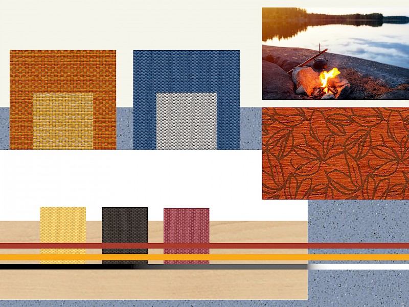
Beach bonfire
The Beach Bonfire color swatch has drawn its inspiration from a lakeside landscape scented with coffee brewed over an open fire.
Like red, the ability to see shades of orange and yellow is retained for a long time by a person whose perceptual ability declines as memory illness progresses. For such a person, shades of blue disappear first. The person perceives these "lost colors" as gray. Therefore, it is important that blue furniture stands out from the floor and wall colors through darkness contrast.
Upholstery fabrics
Incas 9305 orange
Incas 9303 yellow
One 6512 blue
One 8504 gray
One 3007 yellow
One 2007 brown
One 4079 red
Patterned upholstery fabric
Tulip 9 orange
Metal colors
RAL1028 melon yellow
RAL3016 coral red
RAL9016 white
RAL9005 black
RAL7042 gray
Wood parts and table surface colors
Birch
White
Floor
Bluish

Woodland
Woodland swatch brings the safe feeling of a woodland haven, where among the shadows one might spot a fluffy-coated bear slowly padding along, occasionally snatching berries into its mouth.
Green is a calming and inviting color. Together with brown, it creates safe images of the Finnish forest. The darkness contrast of the green color must be significant when paired with the floor and walls.
Upholstery fabrics
Fox 9703 green
Fox 9302 brown
Fox 9114 light brown
One 4566 terracotta
One 6591 turquoise
One 7022 green
One 2007 brown
Patterned upholstery fabric
Tulip 11 brown
Metal colors
RAL6034 pastel turquoise
RAL1028 melon yellow
RAL9016 white
RAL9005 black
RAL7042 gray
Wood parts and table surface colors
Birch
White
Floor
Light wood

Color swatch structure
The background of the color swatch features the shades of the walls and the floor. In the upper right corner is an inspiration image from which the swatch drew its inspiration.
On top of the floor shade are the recommended wood shades, and running across them are the metal colors in long horizontal stripes. Below the metal colors are the recommended colors for small upholstered surfaces, such as the upholstery for dining chairs.
The large squares contain the recommended colors for large upholstered surfaces, such as sofas and armchairs. Additionally, below the inspiration image is the patterned fabric that can be used on any upholstered product.