Design
Product Features
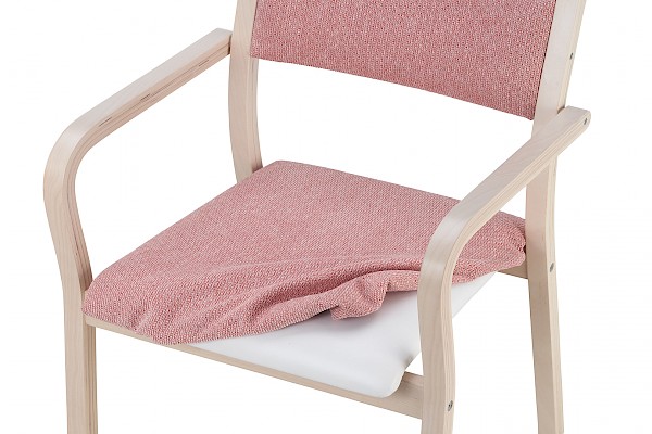
Product design has focused on ergonomics and ease of seating. Most seats feature a curved front edge and long armrests to aid in standing up. The cushions are firm. This makes the seats easy and safe to sit down in and stand up from, and comfortable for even longer periods.
All our products are upholstered with high-quality, fire-safe fabrics. Most upholstery can be selected as either fixed (non-removable) or removable. The removable upholstery is water-washable if the fabric's properties allow it. The padding for the removable upholstery is moisture-protected.
We detail the various features of our products on each product page using the symbols and categories below. For example, almost all our products (with the exception of a few chair models) are suitable for seniors. You can also search on the main product page by selecting a specific product feature.


Suitable for the elderly


Accessibility

Removable and washable upholstery


Moisture protected


Increased


Stackable

Linkable

Hanging
Age friendly design
Our Product and Design Manager, Minna Salokannel, and Sales Manager, Riikka Raittila, held an engaging expert presentation at the KOPA Home Care and Assisted Living event in November 2023. The topic was Age-Friendly Design and Design for All. You can either watch the video or read about the subject in the article below.
What Do Age-Friendly Design and Design for All Mean?
Age-Friendly Design is a form of design that takes the user's needs into account. It is design done in a way that the product does not stigmatize its user. It represents a new perspective on the furniture available in the market.
Design for All means that the design is suitable for all of us, with our differences and special requirements.
At Alastek, product design ideas stem from one's own life and loved ones. Our mission is to create furniture that is more than just furniture.
Product design through personal life experiences
Our Sales Manager, Riikka, describes the real-life perspective as follows:
"My grandparents have always been close to me, so I have followed very closely what aging entails. A 90-year-old lady once told me that old age just means the body can't keep up with the thoughts of a twenty-year-old. Well, that's one perspective, and for others, it might mean the legs would go, but the mind won't. My own experiences relate to both of these. Especially my grandfather's illness, where even sitting at the dining table caused difficulties, let alone sitting down and getting up. So, if we talk purely and simply about sitting, we are at the core of everyday challenges."
"I watched my grandmother, who suffered from Lewy body dementia, for many years. Unfortunately, one side of her became paralyzed during an operation, and it was, of course, the stronger side. She rehabilitated reasonably well, but sitting and getting up also caused particular difficulty from the time of the paralysis. There was nothing to get support from, and nothing to rely on. So-called standard furniture just didn't work. If special furniture was available, it immediately looked like medical aids, and the different models looked quite similar to each other. Ultimately, I was left wondering what kind of furniture I would want around me when it's my turn to be frail," says our Product and Design Manager, Minna, speaking about the experiences of her loved ones.
Age-Friendly Design in Furnishing
Age-friendly design in furnishing means that the product must meet certain requirements starting from its basic premises. Above all, the product must be safe, and safety manifests in several different ways. Safety includes a furniture item's durable and sturdy structure, and it also involves considering operational and fire safety.
Accessibility and ergonomics are important factors. Accessibility, at its simplest, means correct furniture dimensions, and ergonomics means the furniture is comfortable to use. This means the furniture items have the correct proportions and support a person's natural posture. Taking ergonomics into account in design is, generally speaking, an understanding of the human being at different life stages and in different environments.
Self-reliance here refers to furniture features that support a person's independence. Easy maintenance involves correctly selected and durable materials for a given environment. One must know how the environment the furniture is designed for actually operates.
Naturally, the furniture also has aesthetic requirements. The aesthetic viewpoint is highly personal, but there are certain general rules, such as proportions. In this context, we can talk about pleasantness; the furniture must be part of a comfortable environment. And when memory declines, color schemes can be used to account for difficulties in perception and changes in vision.
What is home-like to you may not be to me
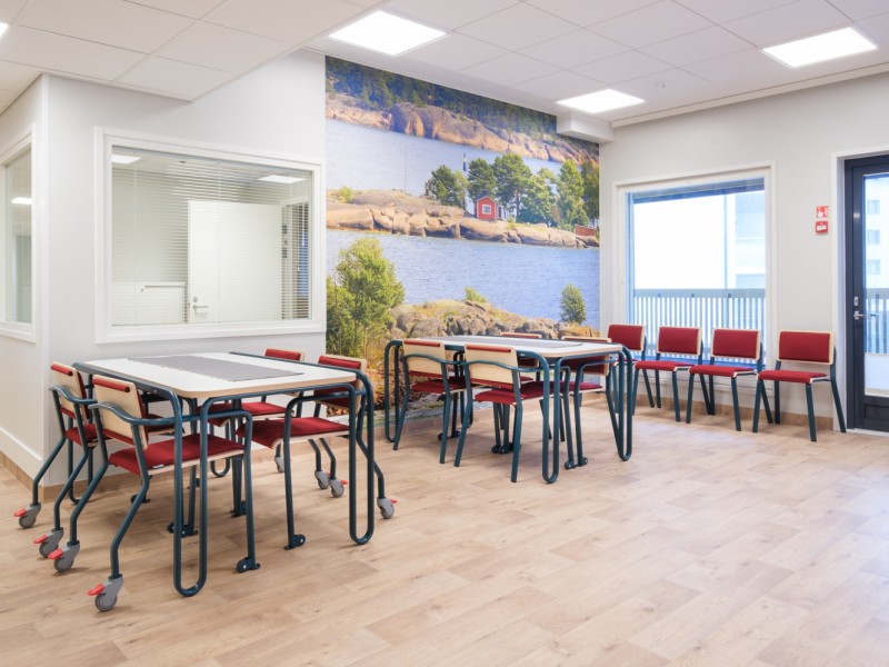
Regarding the appearance of the furniture and our own observations, we noticed quite soon after coming to Alastek/Summanen that all care furniture on the market looked very similar. This presented a clear contradiction to what home furnishing offers and what homes actually look like.
We live in an age where there are many different options, and it is understood that there is no single right style for doing things. Yet, in the appearance of care furnishing, the word "home-like" is very often used as a definition, and this implies furnishing in a single style, which is subjectively assessed.
Home-like quality is formed by the sum of all things within the walls. What is home-like to you may not necessarily be home-like to me. "Home-like" should open up options for a new appearance, not rule them out.
User-centricity
Next, we arrive at a topic closest to our hearts: user-centricity. User-centricity does not exclude design; on the contrary, it places higher demands on the design work.
In user-centric design, it’s easy to focus on only one user group. If we consider, for example, a piece of assisted living furniture, like a chair, the following groups must be taken into account: residents, care personnel, cleaners, and decision-makers.
Each of these groups has its own requirements. At its best, user-centric design also offers perspectives that the previous groups hadn't even known to demand. For example, for the cleaner, easy cleanability, high-quality, and fit-for-purpose surface materials are important, but also that the furniture is operational even when its upholstery is being washed. The care personnel appreciate ease of use, and their well-being is nurtured through proper ergonomics. The decision-maker looks at the issue in light of figures. The purchase must be high-quality, long-lasting, and cost-effective. The product's lifespan can be extended through maintenance and spare parts service. The purchasing decision is made easier by the fact that everything doesn't have to be acquired at once; additional features can be purchased for the product later. If we continue to talk about a chair, the chair is fully functional as a hard seating surface and has taken into account the possibility of adding upholstery later.
"One might think that almost all forms of chairs and tables are already on the market. And initially, we thought it was impossible to add value to these products. However, based on our own observations, we knew that something more was needed. We are fortunate to have both health and welfare sector manufacturing expertise and furniture expertise at our disposal. We decided to investigate whether combining these two could create furniture that has assistive features but does not look like aids. In practice, we combined engineering skill and design. We knew we were onto something when we saw the initial reaction from people to whom we presented our idea. It did more than what was expected of the furniture," Minna comments.
Our mainio furniture collection
At the design table, imagination is the limit. It is the basic work of a designer to capture the best ideas from imagination and produce a concrete form. It's difficult to limit ideas without constraints, and fortunately, the needs served as the necessary constraints we had to follow.
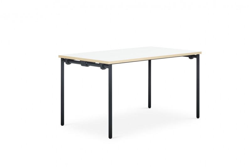
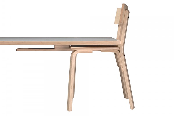
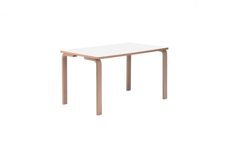
For the table, the needs were an accessible table and an assist handle. These needs gave rise to new thinking, and the greatest innovation was making the handle an essential part of the frame structure, rather than adding a handle to the side of the table.
This means that in addition to supporting the table's top, the frame structure also functions as a grab surface. The grab surface makes it easier to sit down, stand up, and even basic sitting. Because of these features, the grab surface enables the resident's more independent functioning, and this is the core of age-friendly thinking.

For example, a resident using a rollator can transition their grip from the rollator to the table's assist handle. This supportive grip can be maintained throughout the process of sitting down and vice versa when moving away. The supportive grip creates a sense of safety, and the need for a hand grip is even more pronounced with certain illnesses. The table's frame structure also forms a non-slip barrier. In this case, the frame is slightly higher than the tabletop, preventing a plate from sliding into one's lap or onto the floor.
Minna describes the design work for the Mainio furniture collection as follows:
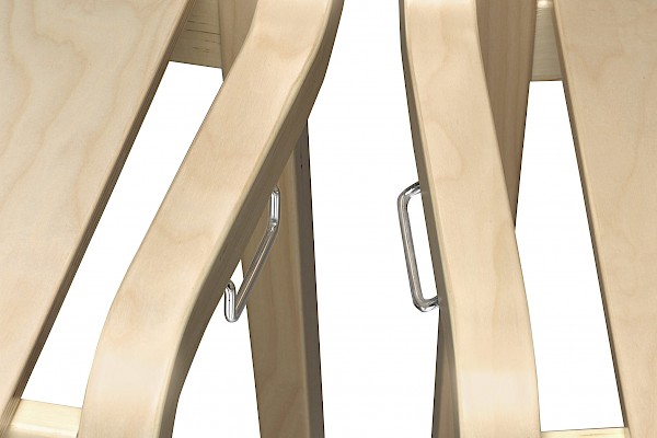
"I didn't want a separate push handle on the Mainio chair. A push handle is one of those things that easily stigmatizes the product, the space, and the user. It's something I try to avoid whenever I can. Because the table's frame structure does more than just meet the minimum requirement, I wanted the same to happen with the chair. In the chair, the frame structure functions as a push handle. In fact, moving the chair by gripping the frame is more ergonomic than moving it by a push handle. In one case, you lift with your legs; in the other, with your arms and shoulders. Moving the chair can be made easier with either two castors on the front legs or four castors."
The chair's assistance brings us back to one of the most important aspects of age-friendly design: safety. During assisted chair movement, the joints of the chair's frame are under immense stress. Safety can be increased by choosing a material more durable than wood: metal. This material choice is essential, especially when talking about four-wheeled chairs. This material also enabled the manufacturing of bariatric chairs, whose durability requirements are a minimum of 150 kg and 300 kg, while a standard chair is tested with a maximum of 110 kg. In fact, when these chairs underwent load-testing, they reached strengths of 1600 and 2000 kg. This is that design for all thinking. Products in the same series serve different user groups without marking the special characteristics of that group.
The many possibilities of color
The material also allows for a countless number of colors. The color selection for metal paints is considerably more comprehensive than for wood, and the colors can be bright or muted. If choosing is difficult or if you are considering how to take changes in vision due to age and memory illness into account, we have compiled a few memory-friendly color swatches. These swatches feature selected colors that help with better perception of the environment.
Key to the use of colors in the environment of a person with memory illness are the contrasts between shades of darkness. It is necessary to consider the color of the floor in the space and ensure the furniture stands out from it. Everyone should put themselves in the visual environment of a person with memory illness, where contrasts are perceived similarly to seeing everything in black and white. It is an equally subdued color world because the perception of colors fades. Blue is usually the first to fade, and red is usually the last. The environment must have color.
"Environments that have had the courage to use color have been extremely satisfied and have given us good feedback," Riikka states.
With this information package, we wanted to illustrate how we solve everyday problems through planning and design. We create furniture to serve all user groups because design belongs to everyone.
Memory-friendly color design and color swatches
As we age, the visual acuity of many people declines. Seeing in low light becomes more difficult, colors fade, and blind spots may appear in the field of vision. When the changes caused by aging combine with the changes brought on by memory illness, such as the weakening of cognitive skills, the environment plays a large role in a person's ability to cope independently.
Colors, and especially darkness contrasts, help a person with memory illness perceive the space and the furniture within it. Color and light are used to create an atmosphere of warmth and safety in the space. Color and light are, therefore, an inseparable pair. The color of the light affects how we perceive color. The perception of color is always also influenced by the other colors it appears with, meaning "a color is only a color when placed next to another color."
A person with memory illness perceives furniture better when it stands out in darkness contrast from the colors of the floor and walls. The perception of a furniture item is made easier when its different parts are of different colors and sufficiently different in shade. For example, the perception of an armchair is helped when a different colored upholstery is chosen for the seat cushion than for the frame and backrest.
The sense of touch has a particularly great significance for a person whose sight has weakened. The sense of touch is one of the senses that is best preserved even as memory illness progresses. The touch of a pleasant material is calming and generates feelings of pleasure.
All fabrics selected for the color swatches are fire-safe, water-washable, and have high abrasion resistance values. The fabrics chosen for the swatches include coarser structured fabrics, smooth dense-surfaced fabrics, and velvety soft chenille fabrics.
Interior designer and accessibility surveyor (ESKEH) Tuija Salmi has compiled three color swatches inspired by the Finnish nature, which aid in the selection of furniture materials and colors.
The space in colors
Colors create atmosphere in a space.
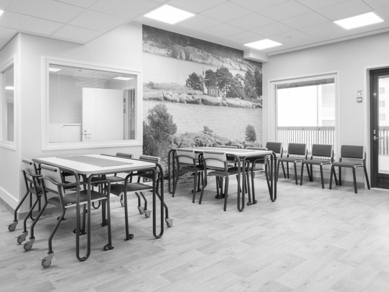
The same space in black and white.
Contrasts help in perceiving furniture.

Berry basket
Different shades of red playfully mingle in the berry basket. A few green twigs have also fallen into the basket.
A person with memory illness retains the ability to see shades of red for the longest time. Red as a color is encouraging to action. The reds in the berry basket are slightly subdued, which gives the red color a bit of softness and delicacy.
Upholstery fabrics
Incas 9404 red
Incas 9420 red/gray
Alba 4027 red
Alba 4007 wine red
Alba 7029 green
Patterned upholstery fabric
Tulip 8 red
Metal colors
RAL6013 reed green
RAL6019 sap green
RAL9016 white
RAL9005 black
RAL7042 gray
Wood parts and table surface colors
Birch
White
Floor
Gray
Color swatch
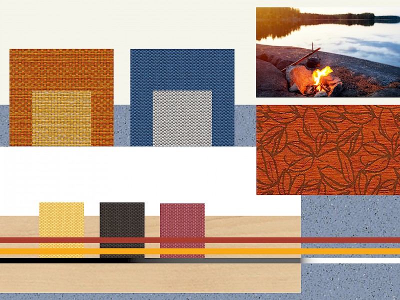
Beach bonfire
The Beach Bonfire color swatch has drawn its inspiration from a lakeside landscape scented with coffee brewed over an open fire.
Like red, the ability to see shades of orange and yellow is retained for a long time by a person whose perceptual ability declines as memory illness progresses. For such a person, shades of blue disappear first. The person perceives these "lost colors" as gray. Therefore, it is important that blue furniture stands out from the floor and wall colors through darkness contrast.
Upholstery fabrics
Incas 9305 orange
Incas 9303 yellow
One 6512 blue
One 8504 gray
One 3007 yellow
One 2007 brown
One 4079 red
Patterned upholstery fabric
Tulip 9 orange
Metal colors
RAL1028 melon yellow
RAL3016 coral red
RAL9016 white
RAL9005 black
RAL7042 gray
Wood parts and table surface colors
Birch
White
Floor
Bluish

Woodland
Woodland swatch brings the safe feeling of a woodland haven, where among the shadows one might spot a fluffy-coated bear slowly padding along, occasionally snatching berries into its mouth.
Green is a calming and inviting color. Together with brown, it creates safe images of the Finnish forest. The darkness contrast of the green color must be significant when paired with the floor and walls.
Upholstery fabrics
Fox 9703 green
Fox 9302 brown
Fox 9114 light brown
One 4566 terracotta
One 6591 turquoise
One 7022 green
One 2007 brown
Patterned upholstery fabric
Tulip 11 brown
Metal colors
RAL6034 pastel turquoise
RAL1028 melon yellow
RAL9016 white
RAL9005 black
RAL7042 gray
Wood parts and table surface colors
Birch
White
Floor
Light wood

Color swatch structure
The background of the color swatch features the shades of the walls and the floor. In the upper right corner is an inspiration image from which the swatch drew its inspiration.
On top of the floor shade are the recommended wood shades, and running across them are the metal colors in long horizontal stripes. Below the metal colors are the recommended colors for small upholstered surfaces, such as the upholstery for dining chairs.
The large squares contain the recommended colors for large upholstered surfaces, such as sofas and armchairs. Additionally, below the inspiration image is the patterned fabric that can be used on any upholstered product.
How to use the color swatches
The color swatches feature a ready-made color scheme based on different floor shades, with the wall color assumed to be light or white.
There are multiple fabric colors, and they can be combined freely, though preferably so that the larger squares form the largest upholstered surfaces, such as sofas and armchairs, and the smaller squares form the smaller upholstered surfaces, such as the upholstery for small chairs.
Multiple different overall schemes can be compiled from the same swatch. We have created two examples from the Woodland swatch, both of which use fabric, wood, and metal colors found within that swatch. The atmospheres of the two spaces are quite different, yet both are pleasant and harmonious.

Color swatch example 1
For Color Swatch Example 1, we have selected shades of blue and brown from the Woodland swatch.
In the color scheme of the Woodland swatch, the floor is light wood and the walls are white.
The wood parts of the furniture are natural birch and the tabletop is white.
The color for the metal parts is RAL6034 pastel turquoise.
The upholstery for the dining chairs is the solid color One 6591 turquoise.
The upholstery for the armchairs and sofas combines the solid upholstery fabric One 2007 brown with the patterned fabric Tulip 11 brown.
The atmosphere is pleasant and calm.

Color swatch example 2
For Color Swatch Example 2, we have selected shades of green, yellow, and red from the Woodland swatch.
In the color scheme of the Woodland swatch, the floor is light wood and the walls are white.
The wood parts of the furniture are natural birch and the tabletop is white.
The color for the metal parts is RAL1028 melon yellow.
The upholstery for the dining chairs is the solid color One 4566 terracotta.
The upholstery for the armchairs and sofas features two shades of Fox fabric: 9703 green and 9114 light brown.
The atmosphere is energizing and safe.
Do you need design assistance?
If planning and implementing your space, or selecting products, becomes too challenging for your own expertise, let us help. Through us, you can access the services of specialists in the field, guaranteeing spaces that are both functional and beautiful. Contact us by email: alastek@alastek.fi
Seating capacities for tables
Are you wondering how many people can sit around a table of a certain size? Here you can easily find the answer, broken down by table and chair model.
Arki tables
Seating capacity
Aika tables
Seating capacity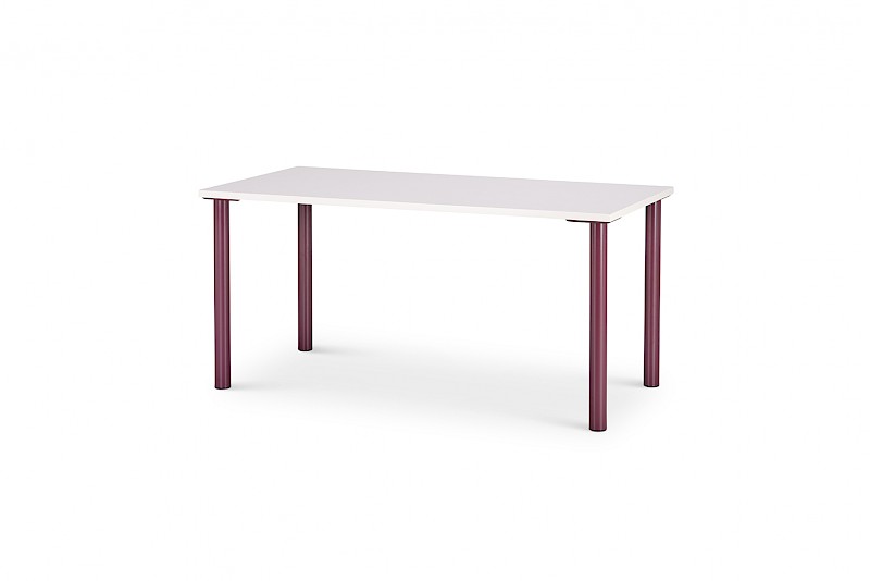
Tovi tables
Seating capacity
Mainio tables
Seating capacity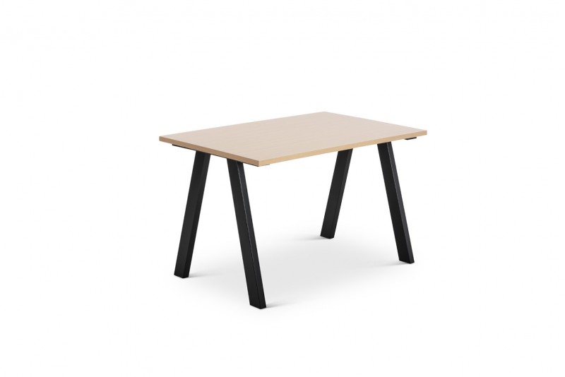
Aatos and Tarmo tables
Seating capacity